Best Fonts for Lyric Videos: Type That Reads at Song Speed
In a lyric video, the words are the picture. A viewer gets one short look at each line before the next one arrives. So the best font is the one they can read in that look, on a phone, over a moving background.
What is the best font for a lyric video?
The best font for a lyric video is a bold sans serif. "Sans serif" means letters without the small feet (serifs) at the ends of strokes. Pick a condensed or geometric one, set at Bold (weight 700) or heavier.
Three safe free picks:
- Montserrat for verses. It's clean, wide and comes in nine weights, so you can go heavier without changing fonts.
- Anton for hooks. It's tall, narrow and heavy by design, so short lines hit hard.
- Poppins as an all-rounder. It's geometric and friendly and reads well at small sizes.
All three are free under the SIL Open Font License, checked on the Google Fonts repository in September 2026. More on licenses below.
Here's the honest part. Any of these can still fail. A perfect font fails if it's thin, if it leaves too fast, or if it sits on a busy background. Those failures cause more unreadable lyric videos than the font name ever does. The rest of this guide is about avoiding them.
The 3 rules that make lyric type readable
Broadcasters solved "text over moving pictures" long ago, for subtitles. Lyric videos aren't subtitles. The words are the main event, so they can be bigger and bolder. But subtitle rules are the best tested floor we have, so we start there.
Weight and size on a phone
Our studio rule: lyric lines go at Bold (700) or heavier. Thin strokes break up when a platform compresses the video and when a phone shrinks the frame.
Line height is the space one line of text takes up, top to bottom. It's the most useful way to talk about text size in video, because it scales with the frame.
For size, the BBC gives a real number. Its subtitle guidelines set the line height at 7% to 8% of the video's height for landscape 16:9 video. For vertical 9:16 video, it's 3.9% to 4.5% of the height (section 9.2.1).
| Video | Frame | BBC subtitle line height | In pixels |
|---|---|---|---|
| Landscape 16:9 (YouTube) | 1920 x 1080 | 7% to 8% of height | about 76 to 86 px |
| Vertical 9:16 (Shorts, Reels, TikTok) | 1080 x 1920 | 3.9% to 4.5% of height | about 75 to 86 px |
Source: BBC Subtitle Guidelines 9.2.1, retrieved September 30, 2026. Pixel values are our arithmetic.
Treat that as the smallest you'd ever go. A subtitle is a quiet helper at the bottom of the frame. A lyric line is the star, so it usually runs much bigger.
Width matters too. The BBC keeps online subtitle lines within 68% of the frame width for 16:9 video, and 90% for square and vertical video (section 3.1). If a lyric line won't fit inside that at a big size, split it into two lines.
How long each line needs on screen
The BBC recommends subtitles at 160 to 180 words per minute. From that, it tells subtitlers to leave text up for at least about 0.3 seconds per word. Its own example is 1.2 seconds for a 4-word line (section 4.1). Here's what that floor means for common lyric lines: 0.9 seconds for 3 words, 1.5 for 5, 2.4 for 8 and 3.6 for 12.
How long a lyric line needs on screen
Minimum time at 0.3 seconds per word, by words in the line.
BBC Subtitle Guidelines 4 and 4.1 (160 to 180 words per minute), retrieved September 30, 2026. Times are words x 0.3 s.
Netflix sets a similar limit in characters. For adult programs, subtitles can run up to 20 characters per second (Netflix Timed Text Style Guide, I.14).
A song won't always give you that much time. A fast rap verse can pack more words into a second than any subtitle rule allows. When that happens, don't shrink the text. Show fewer words at once, or highlight each word as it's sung so the eye has a single target. Our guide to sync lyrics to music covers the timing side.
Contrast beats color
"Contrast" means how much lighter or darker the text is than what's behind it. The W3C's accessibility rule (WCAG 2.2, criterion 1.4.3) asks for a contrast ratio of at least 4.5:1 for normal text. Large text can go down to 3:1. WCAG counts 18-point text, or 14-point bold, as large.
Aim for 4.5:1. The 3:1 figure is the absolute floor, and only for big bold text. Aim high because your background moves. A frame that passes at 0:10 can fail at 0:11 when a bright shot cuts in. Our lyric video color palette guide goes deeper on picking colors that pass.
Want to see these rules applied without touching a font menu? Make a free lyric video and preview your song with designed type, free at 720p with a watermark.
Fonts that work, grouped by job
Pick by the job the text does. A hook needs punch. A verse needs to read fast. A ballad needs warmth.
| Job | Free fonts (license) | Weight to use | Genres | Avoid if |
|---|---|---|---|---|
| Hook, impact | Anton (OFL), Bebas Neue (OFL), Oswald (OFL) | Anton and Bebas Neue are single, heavy weights; Oswald at 600 to 700 | Hip-hop, rock, EDM, pop choruses | Lines are long; narrow letters tire the eye over a full verse |
| Verse, all-rounder | Montserrat (OFL), Poppins (OFL) | 700 or heavier | Pop, R&B, country verses, almost anything | You want a hand-made feel |
| Soft, indie | Nunito (OFL), Quicksand (OFL) | Nunito 700 or heavier; Quicksand at its top weight, 700 | Indie, lo-fi, acoustic, kids | The song is aggressive |
| Handwritten | Caveat (OFL) | 700 (its heaviest) | Slow love songs, acoustic, intimate moments | Tempo is fast or lines are long |
| Serif, ballad | Playfair Display (OFL), DM Serif Display (OFL) | Playfair at 700 or heavier; DM Serif Display has one weight | Ballads, worship, soul | Text is small; thin hairline strokes vanish on phones |
| Western title | Rye (OFL) | Single weight | Country title cards | Used for the sung lyrics |
| Slab, sturdy | Arvo (OFL), Zilla Slab (OFL), Roboto Slab (Apache 2.0) | 700 | Country, Americana, folk, rock | You need a very compact line |
Licenses and weight ranges read from each family's METADATA.pb file in the google/fonts repository, September 30, 2026. Check again before you release.
Bold and condensed for hooks
A condensed font is a narrow one. It fits more letters across the frame, so you can set a short hook huge. Anton and Bebas Neue are built for this; Bebas Neue's own description calls it a display family for headlines. Tall, narrow letters are great for three words and tiring for twelve. Keep condensed faces for the hook and one-word hits.
Clean geometric for verses
Geometric sans serifs, like Montserrat and Poppins, are built from simple circles and straight lines. Their open, round shapes stay clear at small sizes and at speed. That makes them the safe default for verses, where the viewer reads the most words in the least time.
Handwritten and serif: when they work and when they break
Handwritten and serif fonts add feeling, and both break the same way. Their strokes vary in thickness, and the thin parts disappear first on a phone. They work when the song is slow, the lines are short, and the text is big. On a fast verse, they turn into texture.
If you love a script font, use it for one word per line, or for the title card. Keep the sung lines in a clean sans.
Matching type to genre
One short rule per genre gets you most of the way:
- Pop: a clean geometric sans for verses and a bolder weight of the same font for the chorus. Bright color does the rest.
- Hip-hop and rap: heavy condensed type and one or two words on screen at a time. Speed beats the reading-time floor, so cut lines short. See our rap lyric video maker guide.
- R&B: a rounded or geometric sans, softer weights for verses, and slow, smooth reveals.
- Rock: condensed or slab type with grit in the background, never in the letters themselves.
- Worship: a serif or clean sans, large and centered, held long enough for a room to sing along.
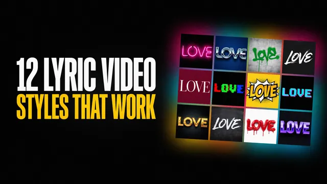
For whole visual looks beyond type, our guide to lyric video styles matches 12 styles to genres.
Country lyric video typography
Country has its own type history. Fonts In Use, a public archive of real-world typography, lists 132 uses tagged "country (music)". Two show the heritage well. Clarendon, a bold slab serif, appears on Paul Cauthen's 2026 "Book of Paul" art. Windsor, a chunky display serif, is on Willie Nelson's 1973 "Country Winners" cover.
Slab serif is a font with thick, square feet on its letters. It reads as wood type, show posters and feed-store signs.
The practical move is a pairing. Use a western display face, like Rye, for the title card. Set the sung lyrics in a clean sans or a sturdy slab like Arvo at Bold. The title says "country". The lyrics stay readable. For story pacing, color and examples, see our guide to country lyric videos.
Two fonts, not five: pairing and hierarchy
"Hierarchy" means showing what matters most by making it bigger or bolder. In a lyric video, the chorus matters most.
Use two fonts at most. One is for verses. One is for the hook. Before you add a second font, try a second weight of the first one. Montserrat at Bold for verses and Montserrat at Black for the chorus is already a clear jump. It also looks designed, because the shapes match.
When you do pair two fonts, make them different in one clear way. A condensed hook font with a wide verse font works. So does a slab title with a sans lyric. Two similar sans serifs side by side just look like a mistake.
Make the chorus jump in size, not just in color. A viewer who looks away and back should know at once that they're in the chorus.
Common font mistakes we fix in client drafts
These are the type problems a studio review looks for first. They're general practice from our production work, listed in no particular order.
- Thin weights. Light and Thin weights look elegant on a big monitor. On a phone, after compression, the strokes break apart. The fix is Bold or heavier.
- Script fonts on fast verses. A connected script needs time to decode. On a fast line it becomes a scribble. The fix is script for a single word or the title, clean sans for the verse.
- Text in the app's button zones. On TikTok, Reels and Shorts, the app puts buttons, captions and the account name on top of your video. Lyrics placed there get covered. The fix is to keep lyrics in the middle band of the frame.
- Too many fonts. Each new font makes the eye re-learn the letters. The fix is two fonts at most, with weight doing the rest.
- All-caps walls. Capitals are all the same height, so a long line of them loses the word shapes that help us read fast. The fix is caps for short hooks, mixed case for long verse lines.
- Low contrast on busy frames. Mid-grey text over a bright, moving shot fails the moment the shot changes. The fix is a darker overlay, a text shadow, or a bolder color.
The same line, two ways
Same lyric, same busy frame. Only the type changes.
Before: thin italic serif, small, no shadow
After: bold sans, larger, soft dark shadow
Illustration made in-house. Font weights and sizes approximate; the lyric line is invented.
Where a vertical app covers your video
Keep lyrics in the middle band, within about 90% of the width.
90% of width
Width guide: BBC Subtitle Guidelines 3.1 (90% for 9:16). Zones are an illustration, not to scale; each app's layout differs and changes.
Font licensing in one paragraph
Free to download doesn't always mean free for a paid release. Check each font's license before you monetize. Most fonts on Google Fonts use the SIL Open Font License (OFL). A few use Apache 2.0 or the Ubuntu Font License, so check each one (google/fonts). The OFL's own site says you can use OFL fonts in videos, with no credit needed. Its main limits: you can't sell the font by itself, and you must keep its copyright and license notices with the font files. Fonts from other sites often come with personal-use-only licenses.
How to get designed type without choosing fonts yourself
If you'd rather not pick fonts at all, that's the job our AI lyric video maker does. Make Lyric Video writes the lyrics from your song, times every word, and sets them as designed, animated type. You don't pick fonts, styles or templates. The design comes from the song.
The free version is a full-length 720p video with a watermark on every frame. There's no account or card, and you can make as many as you like. It's fine to post but not to monetize. $29, one time, gets 1080p with no watermark and commercial rights, emailed to you. If you want type designed by hand for a release, ask for custom typography from our studio.
Preview your song with designed type
Upload your song and watch the lyrics get written, timed and set in motion. Free at 720p with a watermark, no account, no card.
FAQ
What font is best for lyric videos on TikTok and Reels?
A bold sans serif: Montserrat or Poppins at 700 or heavier, or Anton, which is heavy by design at its single weight. Keep lyrics in the middle of the frame, away from the app's buttons and captions. If your tool only exports landscape video, crop a vertical cut in a phone editor and check the lyrics still sit in that safe middle band.
How big should lyric text be on a phone?
Bigger than subtitles. The BBC sets subtitle line height at 3.9% to 4.5% of the height of a vertical 9:16 video, about 75 to 86 pixels on a 1920-pixel-tall frame. Treat that as the floor. Keep each line within about 90% of the frame's width, and split long lines rather than shrinking them.
How long should each lyric line stay on screen?
At least about 0.3 seconds per word. That's the BBC's subtitle guideline, based on reading speeds of 160 to 180 words per minute. A 4-word line needs about 1.2 seconds and a 10-word line about 3 seconds. When a song moves faster, show fewer words at once.
Should lyric videos use all caps?
Use caps for short hooks and single-word hits, where they add punch. Avoid them for long verse lines. Capital letters are all the same height, so long all-caps lines lose the word shapes that help people read quickly. Mixed case is easier to read quickly.
Can I use Google Fonts in a monetized lyric video?
Usually yes, but check the specific font. Most Google Fonts use the SIL Open Font License, which allows use in videos, including commercial ones. Some use Apache 2.0 or the Ubuntu Font License instead. Read each font's license file before release. The font license never covers the song itself.
What font do country lyric videos use?
Country artwork leans on wood-type and slab serif heritage. Clarendon and Windsor both show up on real country covers archived by Fonts In Use. For a lyric video, use a western display face for the title only, and set the sung lyrics in a clean sans or bold slab so they stay readable.