How to Choose a Lyric Video Color Palette (No Design Skills)
A lyric video color palette has three jobs: a base color that fills the screen, a text color the words sit in, and one or two accents for the words that matter. Get those three right and the video looks designed, even if you've never opened design software.
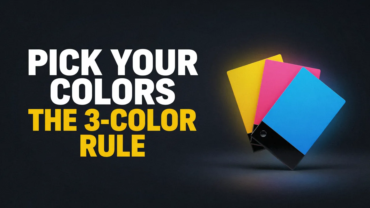
The 3-color rule: base, text, accent
Palette is the small set of colors a video uses on purpose. In a lyric video it usually means three or four colors.
Every palette that works in a lyric video does three jobs, and each job gets its own color.
Base
The color that fills most of the screen: the background, the sky, the gradient. It sets the mood before a single word appears.Text
The color of the lyrics. Its only job is to be read, so it must be much lighter or much darker than the base.Accent
One or two colors, used sparingly. They mark the hook, a punchline or a key word. If everything is accented, nothing is.
As a rough guide, let the base fill most of the frame and keep the accent to a word or two per line. That's the whole system.
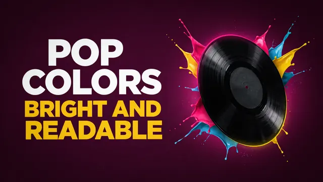
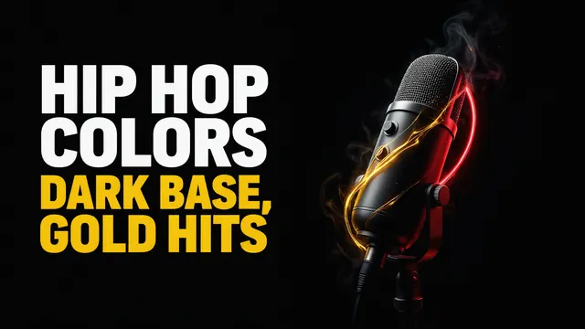
The two genres we get asked about most use the rule in opposite ways. Rap usually runs a dark base with one or two bright highlights; our guide to dark backgrounds for rap lyric videos walks through six. Pop goes the other way: a bright base with dark text. Our bright pop lyric video palettes post has six that pass the contrast test.
Why song energy should set your brightness
You don't need "taste" to match a palette to a song. You need two dials. Brightness is how light or dark a color is. Saturation is how strong or pure a color is. Grey has none. Neon has a lot.
A 2013 study in PNAS tested this with 18 pieces of classical music (Palmer et al., 2013). People in the US and Mexico picked the colors that best fit each piece. Faster music in a major key got lighter, more saturated, yellower colors. Slower music in a minor key got darker, greyer, bluer ones.
The link ran through emotion. The feelings people tied to each piece and to its chosen colors correlated at between 0.89 and 0.99, which is very close to a perfect match. One caveat: the music was Bach, Mozart and Brahms. The mood link should carry across genres, but that study didn't test pop or rap.
An older study shows what each dial does to feelings. Valdez and Mehrabian (1994) showed people color chips and measured their reactions (Journal of Experimental Psychology: General). Brighter colors felt more pleasant. More saturated colors felt more energetic. Brightness also pulled energy down slightly, so very bright colors felt a little calmer.
| Color dial | Effect on pleasure | Effect on energy (arousal) |
|---|---|---|
| Brightness | +0.69 (strong: brighter feels more pleasant) | -0.31 (weak: brighter feels a little calmer) |
| Saturation | +0.22 (weak) | +0.60 (strong: more saturated feels more energetic) |
Source: Valdez & Mehrabian (1994), standardized regression weights, via PubMed. A bigger number means a stronger link. A minus sign means the effect runs the other way.
Put the two studies together and you get four settings you can use today.
| Your song feels | Brightness | Saturation | Try a base like |
|---|---|---|---|
| Happy and upbeat | High | High | Yellow, hot pink, lime, sky blue |
| Dreamy or soft | High | Low | Pastel pink, lilac, cream |
| Sad or slow | Low | Low | Navy, slate, deep grey |
| Dark but intense | Low | High in the accent only | Near-black with one gold, red or electric-blue accent |
Starting points built from the two studies above plus our studio's palette rules.
The last row is how rap, drill and dark pop get both mood and energy. The base carries the mood, and a single saturated accent carries the energy.
Readability first: the contrast numbers that matter on a phone
A mood-perfect palette is useless if nobody can read the words. On a phone the lyrics are small and the background keeps moving, so weak contrast shows up fast.
Contrast ratio is how much lighter one color is than another. It runs from 1:1 (the same color) to 21:1 (white on black).
The web's accessibility standard, WCAG 2.2 from the W3C, sets the bar. Normal text needs at least 4.5:1. Large text (18 point, or 14 point bold) needs at least 3:1. The same page notes that for readers with color vision deficiency, hue and saturation have "minimal or no effect on legibility". Light against dark is what does the work.
Lyric text is usually bigger than web text, so big bold hook words can get by at 3:1. We still aim for 4.5:1 on every sung line, because the background moves under the words.
We tested 16 common lyric-video pairs with the WCAG contrast formula. The chart shows ten of them; the table below has all 16 with hex codes, so you can check our numbers.
How readable common lyric color pairs are
Contrast ratio, text on background. Each chip shows the real pair. Right of the line passes for all lyric text.
Source: our own calculation with the WCAG 2.2 contrast formula, September 2026. Near-black = #0A0A0A. Hex codes in the table below.
| Text on background | Hex (text / background) | Contrast | Result |
|---|---|---|---|
| White on pure black | #FFFFFF / #000000 | 21.00:1 | Pass |
| White on near-black | #FFFFFF / #0A0A0A | 19.80:1 | Pass |
| Black on yellow | #000000 / #FFE600 | 16.57:1 | Pass |
| Gold on near-black | #FFC300 / #0A0A0A | 12.31:1 | Pass |
| Navy on pastel pink | #1B1F5E / #FFD1DC | 10.97:1 | Pass |
| Black on lime | #000000 / #8ACE00 | 10.91:1 | Pass |
| Navy on sky blue | #1B1F5E / #4FC3F7 | 7.46:1 | Pass |
| Electric blue on near-black | #00A3FF / #0A0A0A | 7.24:1 | Pass |
| Black on hot pink | #000000 / #FF3D81 | 6.24:1 | Pass |
| Red on near-black | #E10600 / #0A0A0A | 3.99:1 | Big text only |
| White on hot pink | #FFFFFF / #FF3D81 | 3.37:1 | Big text only |
| White on sky blue | #FFFFFF / #4FC3F7 | 2.00:1 | Fail |
| White on lime | #FFFFFF / #8ACE00 | 1.92:1 | Fail |
| White on pastel lilac | #FFFFFF / #C8B6FF | 1.81:1 | Fail |
| Dark blue on pure black | #1A237E / #000000 | 1.59:1 | Fail |
| Pale yellow on cream | #FFF5B8 / #FFF8E7 | 1.04:1 | Fail |
Pass = at least 4.5:1. Big text only = 3:1 to 4.49:1. Fail = under 3:1. Computed by us with the WCAG 2.2 relative-luminance formula, September 2026. Each swatch shows the real text color on the real background.
Three patterns stand out.
- White text fails on bright backgrounds. Lime, sky blue and lilac all look bold, but white on them lands between 1.8:1 and 2.0:1. Switch to black or navy and the same backgrounds pass easily.
- Red on black is a big-text color. At 3.99:1 it works for one oversized punchline and is too weak for a full verse.
- Dark accents vanish on black. Dark blue on pure black (#000000) is 1.59:1. The hue looks different to your eye, but the lightness is almost the same.
To check your own colors, paste both hex codes into the free WebAIM contrast checker. It shows the ratio and a pass or fail for normal and large text.
What we've seen in client work: brighter palettes tend to draw more views
One pattern keeps showing up when we look back at results. Simple, brighter, more vibrant palettes have drawn higher viewership than the rest. We're sharing it as a pattern we've observed in our own client videos. We haven't run a controlled test, and songs and audiences differ. A bright palette won't rescue a weak song.
It does fit the research above: brighter colors read as more pleasant, and saturated colors read as more energetic.
Three videos from our portfolio show the rule at work. Each one's YouTube page credits lyricvideo.tv, our studio.
- Little Monstaz, "OMG". The title card is candy-bright: a yellow title with a heavy outline over a blue and purple sky, with pink, teal and lime characters. The outline is what keeps a light yellow title readable on a light sky.
- LUNAX, "Paradise" (feat. CERES). The lyric sections sit on bright yellow and white paint splashes, with the lyrics in black graffiti-style type. Cyan echo lines trail the words, and single words pop in yellow or hot pink. Black text on a bright base, with accents saved for one word at a time.
- Christian Anderson Band, "I Heard The Bells". A deep red base with white and gold type and gold bell artwork. One color per job, and nothing extra.
Brighter isn't a law. "I Heard The Bells" runs on a deep, darker base, and it stays readable because the type is white and gold.
Palettes by genre at a glance
Use these as starting points, then adjust to your cover art and your brand.
| Genre | Base | Text | Accent | Watch out for |
|---|---|---|---|---|
| Pop | Bright and vibrant: yellow, hot pink, sky blue | Black or navy | Pink with yellow, pink with blue, red with yellow | White text on pastel or neon |
| Rap / hip-hop | Black or near-black | White | One or two: gold, electric blue; or purple with gold | Dark accents that vanish on black |
| R&B | Night tones: deep blue or black | White or warm cream | Red or magenta, big words only | Red as a sung-line color |
| Rock | Black and white | White or black | One red accent | Too many accents on busy footage |
| Worship | Warm and rich: deep red, cream, gold | White or gold | Gold | Thin gold type on busy textures |
| Lo-fi | Muted, low-saturation warm tones | Cream on dark, or dark on light | One soft color | Mid-tones where text and base get too close |
The pop and rap rows are our studio's rules; the others are starting points from the research. Test every text pair before you publish.
Pop. Pop wants color that feels present. Our studio's go-to pairs are pink with yellow, pink with blue, red with yellow, and black with yellow. The catch is text: on a bright base, dark text almost always beats white. See our bright pop lyric video palettes for six that pass.
Rap and hip-hop. Our default is a dark base plus one or two high-contrast highlights for the intense words and graphics. Black and white works, and so does luxury purple with gold (gold on deep purple #2A0B3D tests at 10.76:1). The full breakdown is in our hip hop color palette guide.
R&B. Night themes suit it: black or deep blue with a red highlight. Keep the red for single big words.
Rock. Black and white with one red accent is a safe start. The contrast between white and black does the heavy lifting.
Worship. Warm, rich bases with white or gold type. "I Heard The Bells" above is a good model.
Lo-fi. Low saturation matches calm music, which fits the research. Muted colors drift toward the middle of the lightness scale, though, so test your text pair.
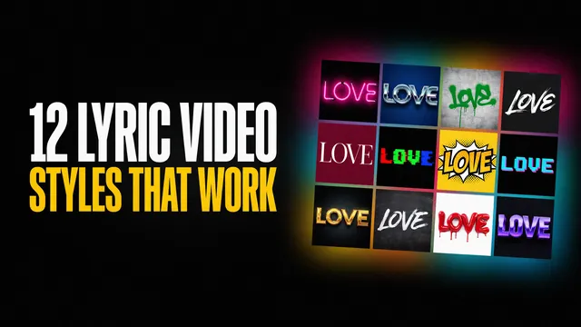
For layout and motion ideas that go with these palettes, see our 12 lyric video styles guide.
Common color mistakes
- Pale on pale. Pale yellow text on a cream background tests at 1.04:1. It looks soft and elegant on a big monitor and disappears on a phone.
- A dark accent on a black base. Dark blue scores 1.59:1 on pure black (#000000), and a deep purple (#6A1B9A) only 2.24:1. If your accent is dark, keep it for shapes and lines.
- White text on a bright or pastel base. This is the pop trap: white on pastel lilac is 1.81:1. Use black or navy text instead.
- Too many accents. Once four colors are fighting for attention, the hook no longer stands out. Keep one accent, two at most.
- A palette that fights your cover art. If the video looks nothing like the single's artwork, the release looks like two different artists. Pull the palette from the cover, which is the next section.
How to pull a palette from your cover art in 2 minutes
Pick the base.
Open your cover and find the color that covers the most area. If the cover is busy, pick its darkest or lightest color instead. Any eyedropper tool gives you the hex code.Pick the text color.
Try black and white against the base. Keep whichever scores higher in the WebAIM contrast checker. Aim for 4.5:1.Pick one accent.
Choose the loudest color on the cover and test it against the base. If it scores under 3:1, keep it for shapes and lines.Apply it in the tool.
In our free lyric video maker, the editor lets you choose a background from hand-picked loop videos and pick how the lyrics move. Choose the loop closest to your base, then preview on your phone.
For the full workflow from upload to export, read how to make a lyric video, or see what our AI lyric video maker does with your song. The free version exports full-length 720p videos with a watermark on every frame. You can post them anywhere, but they can't be monetized. $29 per video gets 1080p, no watermark and commercial rights. The song's own rights stay yours to clear.
Try your palette on your own song
Upload your song, pick the background that matches your cover, and download the full video free. No account, no card.
FAQ
What is the best color for lyric text?
White on a dark base or black on a bright base. Both pairs score far above the 4.5:1 contrast minimum for normal text, and white on black reaches the maximum of 21:1. Pick whichever is opposite your background's lightness, then save color for one or two accent words.
Should a lyric video have a black background?
It doesn't have to. A black or near-black base suits dark, intense songs like rap and drill, and it makes white text and bright accents easy to read. Bright, happy songs usually suit a bright base with dark text. Match the base to the song's mood first.
How many colors should a lyric video use?
Three or four: one base, one text color and one or two accents. More accents compete with each other, and the words you want to stand out stop standing out.
Should my lyric video match my album cover?
Yes, in most cases. Pull the base and accent from the cover art so the release looks like one project. Then test the text color against the base. Cover colors are chosen for a still image, and moving words need more contrast.
Do bright colors get more views?
In our studio's client work, simple, brighter, more vibrant palettes have drawn more views than the rest. That's an observed pattern; we haven't run a controlled experiment. Research does link brighter colors with pleasure and saturated colors with energy, which may explain part of it.
What color text is easiest to read on a phone?
The color with the most contrast against its background. White on pure black, white on near-black and black on yellow are the strongest pairs we tested, at 21:1, 19.80:1 and 16.57:1. On any bright or pastel background, use black or navy text instead of white.