Pop Music Color Palettes for Lyric Videos (Bright and Readable)
Pop lyric videos look best bright. But bright backgrounds hide a trap: the white text most people reach for almost disappears on them. We measured it. White text on a bright yellow background has a contrast ratio of 1.27:1. Contrast ratio measures how different text and background are in lightness, from 1:1 to 21:1. The minimum for normal text is 4.5:1.
Why pop wants bright color
A color palette is the small set of colors a video uses over and over. In a lyric video it has three jobs. The base is the background, the text color is for the lyrics, and one or two accents highlight hooks and key words.
Pop tends to pull that palette toward bright. That isn't only taste. In a 2013 study, Stephen Palmer and colleagues tested how people match music to color (Palmer et al., PNAS 2013). People in the US and Mexico picked colors for 18 pieces of classical music. In both countries, faster music in a major key got colors that were "more saturated, lighter, and yellower". Slower, minor music got darker, duller, bluer colors. The link ran through emotion. The feelings people heard in the music matched the feelings they saw in the colors, with correlations between 0.89 and 0.99.
Saturation is how strong a color is. Neon pink is highly saturated; dusty pink is not. "Lighter" simply means closer to white.
One honest caveat: the study used Bach, Mozart and Brahms, not pop. But much pop shares the ingredients it tested: upbeat tempos, major keys and happy or high-energy moods. So a bright, saturated palette tells a viewer "this song is fun" before they read a word.
The bright-background trap: white text fails
Bright backgrounds create the most common mistake we see in pop lyric videos. People put white text on them, because white text works on the dark backgrounds they've seen in other videos. On a bright base, it fades away.
Contrast ratio is a number that measures how different the text and background are in lightness. It runs from 1:1 (no difference, like white on white) to 21:1 (black on white).
The web's accessibility standard, WCAG, asks for at least 4.5:1 for normal text and 3:1 for large text (W3C WCAG 2.2). WCAG was written for web pages. It's still the best public yardstick for "can people read this on a phone". For the full rule and how to test your own colors, see our lyric video color palette guide.
We measured white text and black text on six bright pop backgrounds, using the WCAG formula. The hex code after each color is its exact digital value, so you can type it into any design app.
White text fails on bright backgrounds
Contrast of white vs black text on six pop backgrounds. Longer is easier to read.
Our own measurements with the WCAG 2.2 contrast formula, September 2026.
White text failed every time. It scored 1.27 on yellow, 1.36 on pastel pink, 1.81 on lilac, 1.92 on lime, 2.00 on sky blue and 3.37 on hot pink. Even hot pink, the darkest of the six, leaves white under the 4.5 line. Black text passed every time, with room to spare: 16.57, 15.41, 11.59, 10.91, 10.48 and 6.24 on the same six.
You don't have to use pure black. A deep navy like #1B1F5E still scores 10.97 on pastel pink, and it feels softer. Rap does the opposite, with a dark base and bright highlights; our hip hop color palette post covers that side.
Bright base, dark text. Dark base, bright text. Never bright on bright.
Six pop palettes that pass the contrast test
These six come from our studio's own pop work. Our designers return to six pairings: pink and yellow, pink and blue, red and yellow, black and white with red, black and yellow, and a night look in black, blue and red. We test more than one palette for most videos. The final pick follows the song's theme, its vibe and the artist's brand.
Each palette below has one base, one text color and one accent. The contrast number is for the lyric text on the base.
| Palette | Base | Lyric text | Accent | Text contrast | Best for |
|---|---|---|---|---|---|
| Pink + yellow | Yellow #FFE600 | Black #000000 | Hot pink #FF3D81 | 16.57:1 | Summer singles, dance-pop, anything loud and happy |
| Pink + blue | Pastel pink #FFD1DC | Navy #1B1F5E | Sky blue #4FC3F7 | 10.97:1 | Soft pop, love songs, bedroom pop |
| Red + yellow | Red #E10600 | White #FFFFFF | Yellow #FFE600 | 4.97:1 | High-energy hooks, party tracks |
| Black + white + red | White #FFFFFF | Black #000000 | Red #E10600 | 21:1 | Clean, editorial, confident pop |
| Black + yellow | Black #000000 | White #FFFFFF | Yellow #FFE600 | 21:1 | Bold pop, pop-rap crossovers, strong brands |
| Night pop | Midnight blue #0B1026 | White #FFFFFF | Red #FF3B3B | 18.81:1 | Late-night synth-pop, moody dance tracks |
Source: Our own measurements with the WCAG 2.2 contrast formula, September 2026.
A few notes on using them.
Accents are for shapes and single words, not full lines. Hot pink text on yellow scores only 2.66, and sky blue on pastel pink scores 1.47. Both fail. So in the first two palettes, use the accent for shapes, underlines and highlight boxes. Black text inside a hot pink box still scores 6.24. Navy inside a sky blue box scores 7.46.
Red + yellow is the tight one. White on red scores 4.97, just over the line. Black on that red scores only 4.23, so it fails. Yellow on red scores 3.92, which passes only the 3:1 rule for large text. Use yellow for one big hook word at a time, never for a full verse.
Pick the brighter red for night looks. Our night red #FF3B3B scores 5.32 on midnight blue. A deeper red like #E10600 drops to 3.79 on the same base. On dark bases, brighter accents read better.
Two accents is the ceiling. One base, one text color and one or two accents is enough. Past that, the hook stops standing out, because everything is highlighted.
Borrow your palette from the cover art
The fastest way to get an on-brand palette is to take it from your single or album cover. Fans will see the cover on Spotify and Apple Music. A lyric video in the same colors tells them it's the same release.
Charli XCX's Brat is the modern example of one-color branding. Its cover is the lowercase word "brat" on a flat chartreuse (yellow-green) background (Wikipedia). You don't need to be that strict, but the idea travels: a strong main color that repeats everywhere.
To pull a palette from your own cover:
Grab the strongest colors.
Open the cover in any free color picker and note two or three hex codes.Make the biggest or brightest one your base.
That's the color fans already link to the release.Test black and white text on it.
Keep whichever scores higher. On a bright cover color, that will almost always be black or a very dark shade.Keep one other cover color as your accent.
Use it for shapes and single hook words, as in the palette notes above.
From our studio: what bright palettes did for our clients
We've made 800+ custom lyric video projects over more than a decade. Across that work, one pattern has held up. When we've looked at how our clients' videos performed on clicks and views, the simpler, brighter, more vibrant palettes have done better than the rest. That's an observed pattern from our own client work, not a controlled study. The Palmer research above offers one likely reason: bright color signals an upbeat song before anyone presses play.
LUNAX, "Paradise" (feat. CERES) is a good example from our portfolio. The lyric sections sit on a bright yellow and white paint-splash background. The main lyrics are thick black graffiti letters, and echo lines and brush strokes come in cyan. Some key words, like "Angel", jump out in yellow with a black outline, and hot pink shows up on single words. It's the pink + yellow logic from the table above: bright base, dark text, accents on single words.
Getting your palette on screen
Our free lyric video maker designs and animates the type for you from your song file.
The free version is a full-length 720p video with a watermark on every frame, and you can make as many as you like. You can post it, but you can't monetize it. For $29, one time, you get 1080p with no watermark and commercial rights, sent by email. Neither license covers the song itself; those rights stay yours to clear.
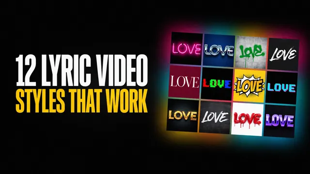
If you want a palette built exactly from your cover art, with custom type and accents timed to your hooks, that's studio work. Our Pro packages cover it. For more looks beyond color, see our 12 lyric video styles guide.
Make your pop lyric video free
Upload your song, watch the full video render, and download it free. No account, no card.
FAQ
What colors represent pop music?
Bright, saturated colors are the usual pop look: yellow, hot pink, pastel pink, sky blue and lime. Research on music and color backs this up. Fast, major-key, happy music gets matched with lighter, more saturated, yellower colors. Night-time pop can go dark instead, with bright red or pink accents.
Can I use white text on a pastel background?
No. White text on pastel pink measured 1.36:1 and on pastel lilac 1.81:1. The minimum for normal text is 4.5:1. Use black or a deep navy instead. Navy #1B1F5E on pastel pink measured 10.97:1.
Should a pop lyric video use pastel or neon colors?
Match the song. Pastels suit soft pop and love songs, and neon or strong colors suit dance-pop and big hooks. The text rule is the same for both: on a bright or pale base, use dark text. White text failed on all six bright backgrounds we tested.
What text color works on a bright background?
Black, or a very dark color like navy. Black text scored between 6.24:1 and 16.57:1 on the six bright backgrounds we measured, so it passed the 4.5:1 minimum every time. White text scored between 1.27:1 and 3.37:1 on the same backgrounds.
How many colors should a pop lyric video use?
Three or four: one background, one text color and one or two accents. More accents make the hook harder to spot, because too many words are highlighted.